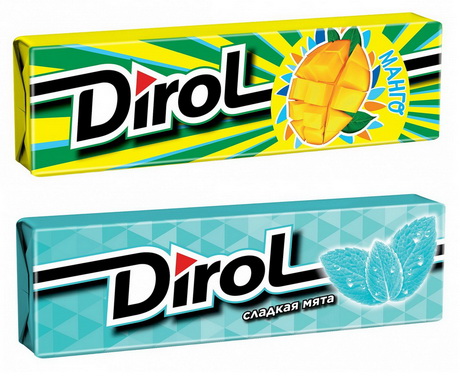
Dirol, a chewing gum brand (owned by Mondelez International), appeared in Russian stores in the new packaging with an updated logo in early June. Dirol’s modern design has become part of a large global project, aimed at bringing the designs of all the Trident’s family brands “to a common denominator”.
The idea of the new design belongs to an international agency Pearlfisher. Mondelez International’s representative notes that these changes are based on interesting graphics in the background, mouth-watering illustrations and an updated logo of the brand. “The packaging has become even more “delicious” and bright. The new logo “flows” from one pack to another, making sort of “garlands” of Dirol on the stand,” authors of the project say.
In Russia, the project has been traditionally implemented by UNIQA C.E. The agency's task was to visibly change the packaging, while maintaining continuity in terms of color coding and key design elements of basic flavors.
“We hope that the updated brand will be favorably accepted by our consumers, attract attention and give another reason to take a fresh look at the variety of flavors in our portfolio,” it is noted by Mondelez’s representatives.
Previously, the brand was updated in 2013. Then, the team of UNIQA C.E. re-designed the packaging, branding and logo for this chewing gum.

Comments (0)
Twitter
Facebook
Pinterest
E-mail